This was more than a rebrand — it was a resurrection. We took one of London’s most iconic (and quirkiest) restaurants and gave it a new identity that feels just as bold as its portions.
What we worked on
Brand Identity / Logo Design
Year completed
2025
Background
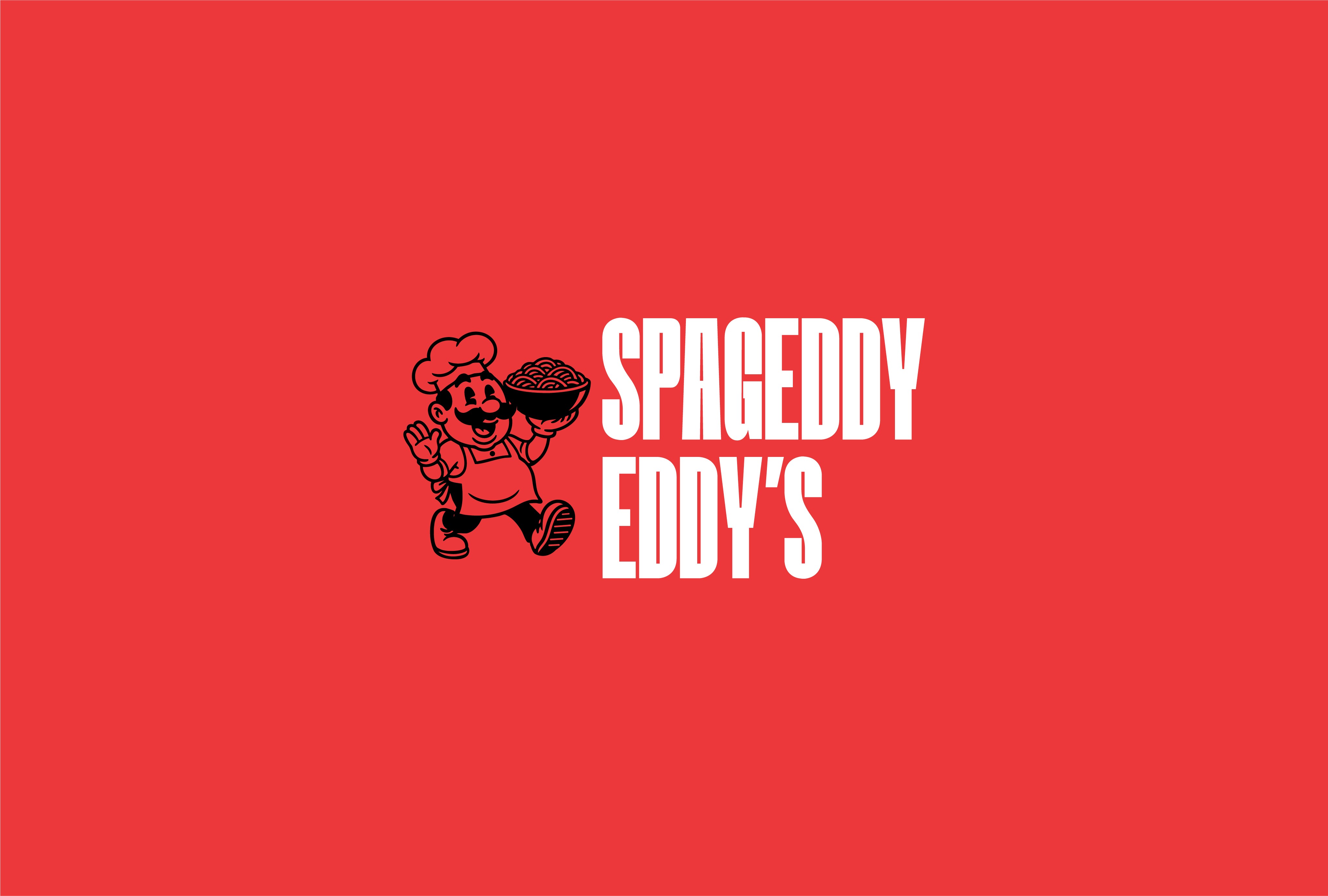
Spageddy Eddy’s has been a downtown gem for years — known for its massive pasta bowls, cozy chaos, and old-school charm. But its brand? Kinda lost in the sauce. So I cooked up a full rebrand from scratch: a new mascot, refreshed visuals, and a custom logo that keeps things playful but polished. The centerpiece? A vintage-inspired spaghetti-loving chef with a big belly and even bigger vibes. Every detail — from the nostalgic character design to the cheeky social posts — was crafted to feel like it belonged on a retro diner menu or a Saturday morning cartoon reel.


Challenges
The biggest challenge was capturing the soul of a place that already had so much personality — without making it feel forced. This wasn’t about chasing trends or doing a full 180. It was about distilling what made Eddy’s Eddy’s and turning it into a brand system that could actually hold together. Balancing nostalgia with a fresh look meant hours of refining character sketches, testing logo layouts, and making sure everything from the chef’s hat to the spaghetti strands felt just right.


Outcome
The result is a brand that people instantly connect with — whether they’ve been eating at Eddy’s for 10 years or just stumbled across it on Instagram. The mascot is loveable, the logo hits hard, and the whole visual world around it feels like a warm bowl of spaghetti on a cold day. It’s vintage without being dusty, playful without being childish, and weird in all the right ways. In the end, Spageddy Eddy’s didn’t just get a new look. It got a new story — one that’s ready to be told across menus, merch, and every noodle-slurping corner of the internet.